

BrightOwl Brand Identity & Website

The Challenge
When Kjeld & Joep reached out, there was a big gap in the quality of the service of their salescoaching business BrightOwl and how they presented themselves online. Together we bridged that gap. Below an image of their website before our collaboration

Starting point
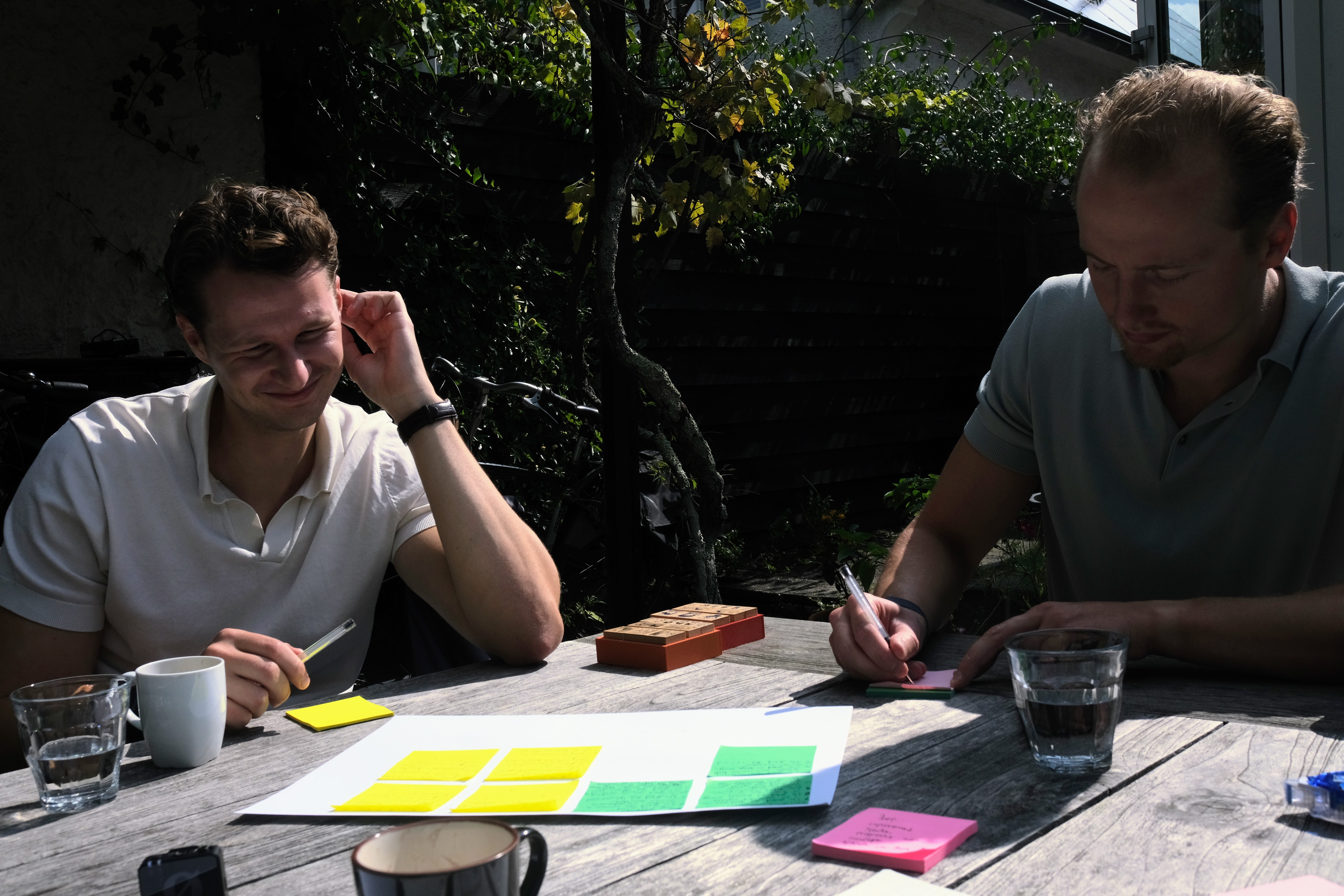
Our objective was clear soon. "No cowboy salescoaching". This meant that we needed to uncover what differentiated BrightOwl from the saturated market of fast money boys. In this first session we found out what made BrightOwl and the founders special and aid the foundation for a healthy brand foundation build from.
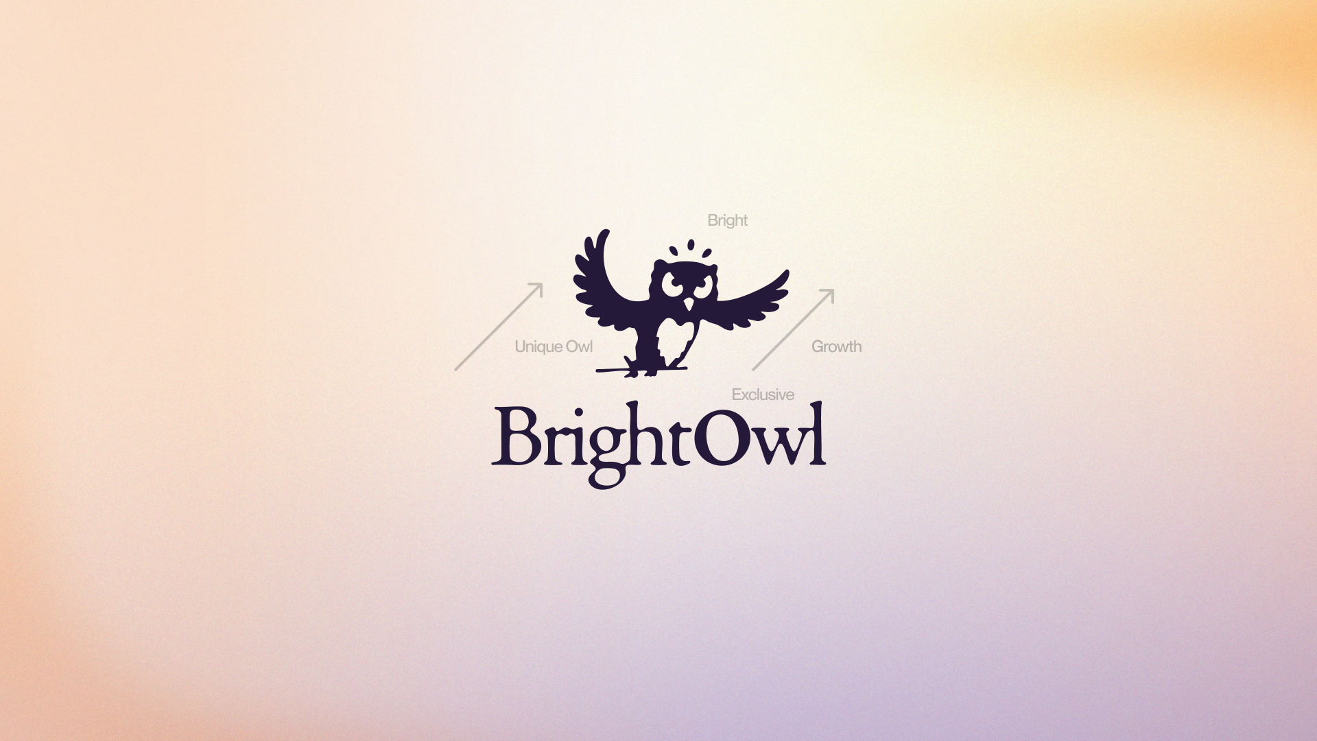
How BrightOwl came to be
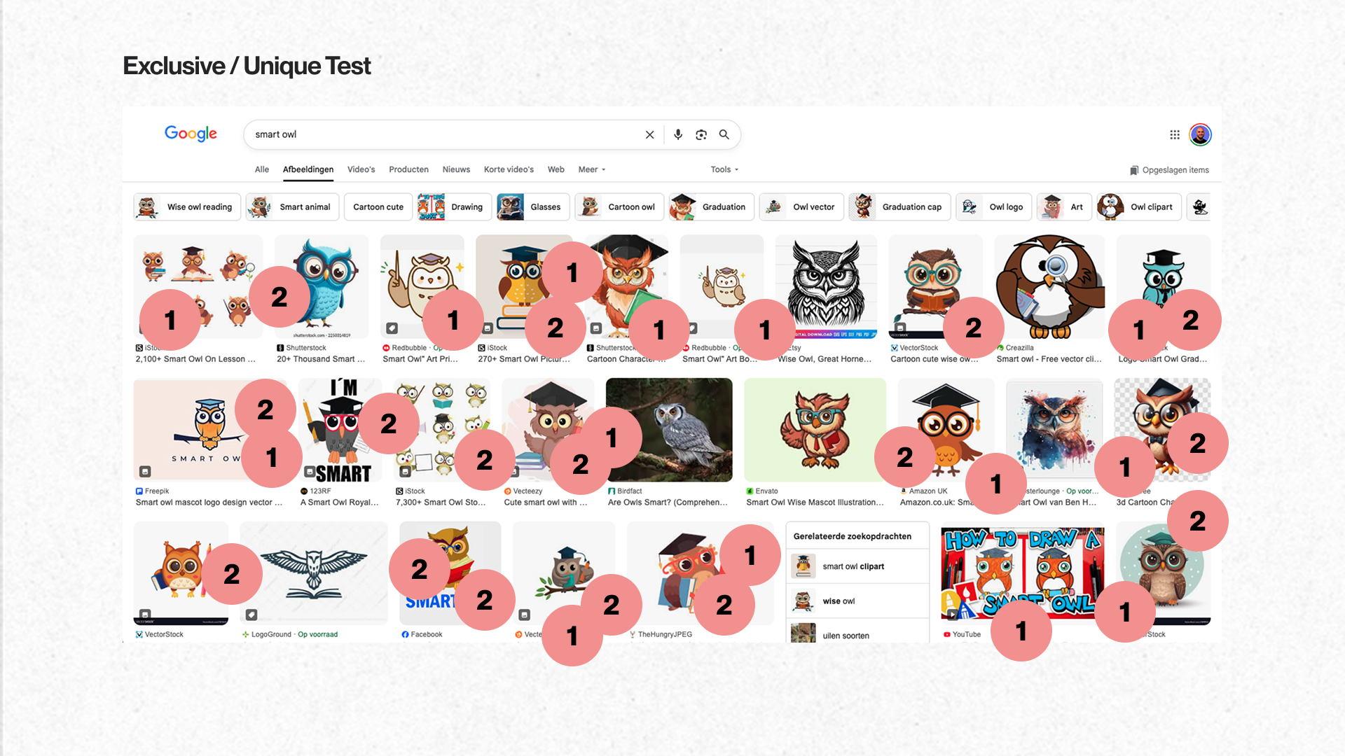
For a founder, letting go of a brand element can feel like losing part of the company's soul. At BrightOwl, that feeling was tied to a graduation hat on their mascot. But our brand session showed a hard truth: BrightOwl wanted to attract a premium audience, and common symbols don't win premium clients. So we looked at the data. A quick Google search for "owl education logo" showed rows of the same cap-wearing mascots. The answer was clear: to look exclusive, you have to stop looking like everyone else. We dropped the hat and built a high-end identity instead.
The Result
Kjeld and Joep had no design background, but they knew what they wanted. My job was to turn that into something they could use. We gave clear, honest feedback to each other at every step. In the end, we built a brand that matched the quality of their service. This was not just about design. It was about giving them the right look to grow their business.


Kjeld Labordus
Founder, BrightOwl